Thursday, January 10, 2013

Will China's Economy Surpass That Of The United States?


About a month ago, I read an intriguing article that suggested that China’s economy would be ahead of the United States as soon as 2030 or perhaps earlier. On the one hand, this makes sense- the article says, “The health of the global economy increasingly will be linked to progress in the developing world rather than the traditional West.” I could easily see this happening. China has definitely seen the greatest spike in economic growth over the long and short term. On the other hand, the patriot side of me simply cannot believe the idea that the U.S. will be surpassed in the global economy that quickly, given the enormous head start we already have. (As of 2011, the United States’ economy was still twice as large as that of China- about 15 trillion to 7 trillion, respectively[1])

When it comes to even statistics, it’s sometimes difficult to eliminate bias. The statistics tell no lies, of course, but the statistician can easily manipulate the data to draw the conclusion that he/she wants to. This can be achieved by only including certain data in a model, for example, or even by blatantly ignoring a significant trend in the data when drawing a conclusion. One could draw that same conclusion that the U.S. has quite a cushioned lead over China, but that would ignore the fact that China’s nominal GDP grew nearly three times as fast from 2010-2011[2].

However, the statistician cannot rely solely on statistics alone. Context and outside information are both needed to present a strong model as well. For example, it is unrealistic to believe that because a baseball player strikes out, he is beginning a brutal slump, just as it’s unrealistic to believe that a country’s economy will immediately go into a terminal downwards spiral because it entered a small recession. Yes, sometimes this will happen, but the probability is still very low.

My task for today’s post is to weigh the claim that China will have surpassed the United States in nominal GDP by 2030, whilst trying to balance the statistics with context and empirical evidence- without letting bias enter the equation. There are many different models I could establish with the amount of data available on this subject- but which is most likely to occur?
 ___________________________________________________________________________________
 
While the global economy continues to grow, it doesn’t grow at the same rate for every country. Some countries experience periods of great economic growth while at the same time other economies begin to decline. This isn’t a random phenomenon; there are many factors that go into it, but in the end it can be boiled down into simple supply and demand economics: The country that has the most of what people want will do the best. If a country can no longer produce or manufacture what is in demand, it will go into decline.

The United States has enjoyed its position at the forefront of the global economy for a long time, but a look at this long term graph (1970-2010) suggests that we have entered a period that could result in economic decline (beyond that which we’ve already experienced, of course):


It looks like the United States is beginning to be out-produced by other countries- namely, China. It’s not an exaggeration to say that other countries are becoming more innovative than the U.S., either[3].

A brief look at these pieces of evidence could be enough to convince someone that the U.S. economy will soon fall behind China. But take a closer look at the graph above: it’s actually set on a logarithmic scale. In this format, an exponential plot would appear linear, and a linear plot looks something, well, more like the U.S. plot. Here’s the same data set on a linear scale:


And a graph for the short-term as well:


These look a lot more promising for the United States. This is just an example of how easy it is to manipulate data to appeal to one’s bias.
 
There are a few other things we should consider rather than just a straight GDP plot. What about the change in GDP from year to year? The derivative of the graphs above could provide a good idea of if and how the landscape of the global economy is changing.

For these and future plots I’m going to eliminate most of the countries listed so that the graph is less cluttered. The seven countries I decided to leave in (before any of the plots were made) are the USA, China, and Japan, the three clear economic leaders; three more countries that are beginning to develop strong economies: Brazil, India, and Indonesia; and Russia, which saw decline after the fall of the Soviet Union and whose economic future is at a crossroads of sorts.

In the short-term, it’s clear that the global economy is filled with complex connections: Every country took quite a hit in 2009. However, all four of the Asian countries still saw an increase in GDP whereas Brazil, the U.S., and Russia saw declines.


It should also be noted that China clearly had a fast recovery and has continued that growth through 2011, while several other countries had strong recoveries in 2010 but did not continue the trend through 2011.

Here’s the derivative of long term nominal GDP. China clearly has shown strong growth recently:


I finally put all of my data together to create a couple of models based on long-term and short-term GDP, and extrapolated them out to the year 2030. The results were somewhat surprising:

Long-Term Graph


Both models suggest that China will surpass the United States well before 2030. There were several other models that had the US remaining on top, or even Japan or India surpassing the other nations. But I’m only posting these two because I feel these two simulations were the most likely to happen. Of the two, I feel much stronger about the former: I don’t see anything that suggests the US’s productivity will go down, but nothing suggests the opposite either. Meanwhile, China’s recent gains will probably continue.

We don’t know for sure what will happen. There’s another trendline for China that suggested it would have nearly the exact same GDP as the US in 2030, and it fit all of the data points through 2005- but because of the spike in 2010, the model no longer fits very well.

My own personal opinion is that the U.S. and China will probably have fairly similar nominal GDP values in 2030. It’s unrealistic to assume that China will continue to have such incredible economic growth as we’ve seen in the past few years, but it is also clear that China will have a strong economy for years to come. I’ll be the first to admit that there could easily be some potential bias in this conclusion, but I believe that I’ve been able to balance the statistics and outside information well enough to give this prediction merit.
_______________________________________________________________________________________


[1] International Monetary Fund
[2] United Nations Statistics Division (http://unstats.un.org/unsd/snaama/selbasicFast.asp)

Thursday, November 22, 2012

Do Consumers Have A Problem With Black Friday Creep?


Before I begin my post today I’d like to wish everyone a happy Thanksgiving weekend, and safe travels to anyone visiting family or friends today to celebrate the holiday.

While today is a day for being thankful, later tonight, after the festivities, thousands of Americans will venture out later tonight for the start of the holiday shopping season. Many stores are opening and holding sales as early as 8:00 PM this year, and are being blasted for the controversial decision.

But exactly how much of a problem does America have with the theory of “Black Friday Creep”? Many people say that this year the retailers have gone too far- but will that stop consumers from going out and getting in line early? Will we see yet another record-breaking sales period? It’s time to see just exactly how hypocritical we are.
__________________________________________________________________________________________________

If there’s one thing we can be certain about, it’s that retailers are opening earlier:


I picked seven major retail chains, most of which specialize in different or all genres of retail. None of them opened before 5:00 in 2008. All of them are opening at or before midnight this year. Even K-Mart and Sears, which had both consistently been among the later openers, are welcoming customers at 10 PM this Thanksgiving.

Opening stores earlier means that there is a greater range of time for people to show up, meaning more customers and more profit. Whether it is because stores are opening earlier or because Black Friday is simply becoming more popular, more customers are showing up, stores are making more money, and- if only slightly- individual customers are spending more money. 


Now for a brief interruption about the Internet: Online spending has been up recently too. Thanksgiving Day spending online was up 18% last year, and Black Friday spending was up 26%. All told, Americans spent $1.295 billion online over those two days last year.

Getting back to in-person shopping, let’s also look at the percent change in total amount spent:

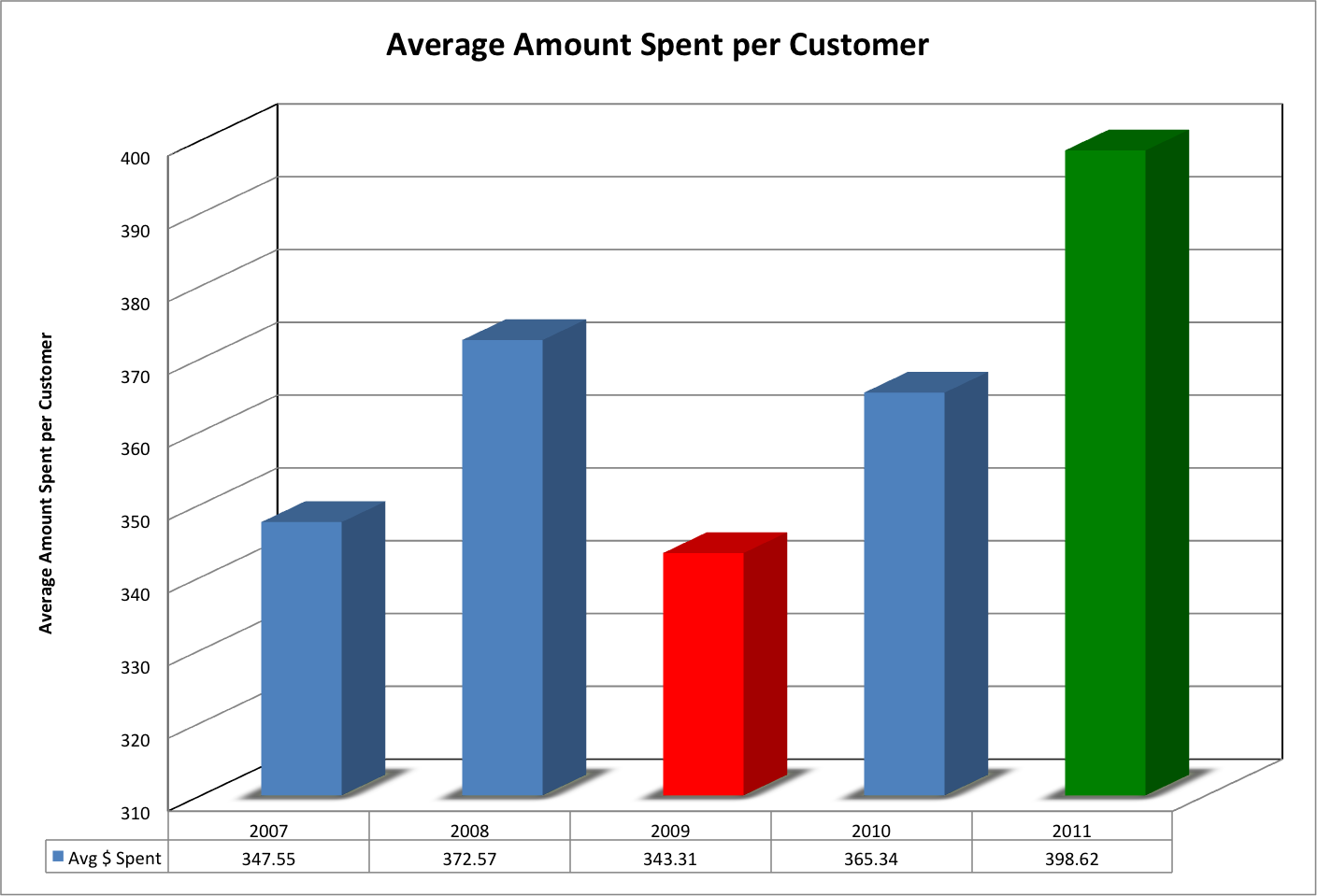
2009 was a down year by all accounts. Individual customers spent the least in that year, and the total amount spent was just barely more than the last year. You could conclude that the recession meant people stopped showing up, but the increase in customers was pretty much the same as between 2007 and 2008. Customers still spent nearly $350 individually on Black Friday in 2009, suggesting that while a recession does have a small impact on most Americans, it’s not enough to stop them from showing up and spending money on Black Friday. And this makes sense- stores usually hold some of their best sales of the year the day after Thanksgiving, making it one of the best days to go bargain hunting on.

Since 2009, however, people are steadily spending more and more.

Now here’s the bad news for retailers:

This graph essentially represents the derivative of the customer graph (for calculus fans out there)- it’s the percent increase in customers over the previous year. While more customers show up each year, the percentage of those that are new customers is slowly but steadily going down. This suggests that at some point- probably after the next few years- Black Friday could top out in terms of customers.

However, I use the phrase “bad news” in a relative sense. When Black Friday finally reaches its customer limit, a good 250-300 million people will be coming out for the sales, each spending an average of about $400. Not bad for retailers at all.

Just for fun, I’ll make some predictions on the type of turnout we could expect for this Black Friday. About 250 million customers (the data suggests 249.8) will show up, spending on average about $393.95. This is actually about five dollars less than the average consumer spent in 2011. However, the spent overall will still increase- a grand total of $56.1 billion*

Let’s get back to issue I talked about at the beginning of the post: the slow creep of stores opening earlier and earlier on Black Friday- and Thanksgiving. Americans say they have a problem with it. Do they?


Not at all. The percentage of total customers on Black Friday that show up at midnight is increasing at an incredible rate. One-quarter of Black Friday shoppers were out at midnight in 2011, a jump of over 600% from 2009. If the trend holds true, we could see nearly half of all consumers out at midnight- or certainly before.

Many Americans are complaining about the Black Friday Creep, but the statistics show that we secretly embrace it. Something needs to drastically change in the average American’s mindset before retail chains put an end to the creep. Until that happens- if it happens- store owners will continue to open earlier and earlier, more and more customers will turn out, and more and more money will be exchanged in the day after- and on- Thanksgiving.

*Why don’t the numbers add up? Most of my data was from the National Retail Federation. I’m guessing they took a survey of Black Friday shoppers and asked them how much they spent for the average individual amount. The number of unique customers is also probably lower than the total here, because many people shop at more than one place on Black Friday.

Friday, October 26, 2012

Can We Find A Trend In The Fungal Meningitis Outbreak?


Epidemiologists have some of the most intriguing jobs in the world. No other branch of science can make an immediate impact akin to that of the study of diseases. The fruit of diligent research can be life- no, world-changing. And when an epidemic strikes, their fast actions can save thousands of lives.

Kudos to the epidemiologists on the case of the recent outbreak of fungal meningitis. I heard about the outbreak, and then one day later they had already located the cause and were doing work to minimize the damage done by the tainted steroids. Unfortunately, they can’t save every life, and nearly 300 cases have been reported with a fatality rate of about 8%. However, their quick work surely saved many more lives.

For my latest post, I’ve decided to play epidemiologist to try an isolate a trend among the data for the meningitis outbreak. Is there a reason that certain states have been hit harder than others? (Besides, of course, the states that haven’t received the infected drugs, and obvious comparisons like population)

_______________________________________________________________________________________________

The CDC website doesn’t have information on former outbreaks of fungal meningitis (or if they do, they’re hiding it very well), and this made my first idea- does this outbreak parallel previous outbreaks?- very short-lived. However, the CDC did have interesting statistics on another topic, which redirected my plan for this post.

The fungal meningitis outbreak has apparently been classified as a “Healthcare-Associated Infection” or “HAI”. The CDC tracks HAIs in a variety of ways; one of them is an SIR value: Standardized Infection Ratio. This value is found by taking the number of actual HAIs and dividing it by a predicted number of HAIs. Lower numbers are better, and values under 0.5 are very good. Similarly, values over 1.0 are very bad- this means that the included facilities are actually causing more infections than they’re projected to.

Here is a chart of the SIR values (in 2010, the most recent I could find) for all of the states where the tainted steroids have been sent:


 These values are mostly good; Indiana is the only state with a value above 1, and Michigan and West Virginia both have values under 0.5 (Remember that!)

You may have noticed that three states- Idaho, Minnesota, and Rhode Island- don’t have SIR values on the graph. This is because SIR values are independently submitted by health care centers, and some states don’t have enough centers submitting information to the CDC for effective calculation of SIR. These three states are some examples- less than five centers submitted information over 2010, whereas most states have several dozen.
Since the outbreak is a HAI, it would be reasonable to assume that most of the infections occurred in states with high SIR values. But that isn’t the case:

STATE
CASES
ILLINOIS
1
NEW YORK
1
IDAHO
1
PENNSYLVANIA
1
TEXAS
1
NORTH CAROLINA
2
MINNESOTA
7
FLORIDA
17
MARYLAND
16
NEW JERSEY
16
OHIO
11
NEW HAMPSHIRE
10
INDIANA
38
MICHIGAN
53
VIRGINIA
41
TENNESSEE
69
CALIFORNIA
0
CONNECTICUT
0
GEORGIA
0
NEVADA
0
RHODE ISLAND
0
SOUTH CAROLINA
0
WEST VIRGINIA
0
TOTAL
285

Indiana, which had the highest SIR value, has quite a few cases compared to other states. Michigan, however, had the lowest SIR value- and has more cases than any state except Tennessee. But West Virginia, which had the second-lowest SIR value, has zero cases.

Why is there variability in the data? One reason is because not every state received the same amount of the infected drug. Only one facility in West Virginia received the drug, compared to six in Indiana. Based on the data, each facility that received a shipment of the steroid had about 3.8 infections. From this average, we can predict how many cases will occur in each state:


This isn’t very good. We can take it our prediction one step further by applying a state’s SIR to the predicted number of cases (for example, Illinois: 11 predicted cases x 0.678= 8 predicted cases with SIR):

 
There’s still no strong correlation here between SIR and the number of cases. We can calculate our own SIR values for these states using our predicted number of cases and the number of actual cases. Unfortunately, when we do this, only four states- the ones in blue on the data table and the following graph- have SIR values that fall within the standard range of scores (that is, the range of scores for all 50 states.):

M-SIR represents my own calculated SIR value based solely on the meningitis statistics


Quite simply, there’s no correlation between HAI SIR values and the recent fungal meningitis outbreak. The only explanation I can come up with for this is that most facilities used the tainted steroid believing it to be safe, whereas with most HAIs the healthcare center should know how to avoid the problem.

My data:

Note: All data as of October 21, 2012

Tuesday, October 9, 2012

How Successful Will The iPhone 5 Be?


When it comes to technology- and specifically, new products- perhaps nothing is more anticipated than the iPhone. When the original iPhone was released in 2007, it was the beginning of the Age of the Smartphones. Since then, Apple has stayed on the cutting-edge when it comes to their iPhones, and excitement and anticipation over technological leaps and bounds precede each release.

Last weekend, Apple released their new iPhone, the iPhone 5. Apple had had nearly a year since its most recent phone, the iPhone 4S, to work on improvements. The major selling points Apple hit on in its press release were the physical features, hailing the new product as the “Thinnest, Lightest iPhone Ever”. For this post, I thought I’d take a look at that claim, and examine the evolution of the iPhone. Is it really the thinnest, lightest iPhone ever? Is there anything that prior incarnations of the smartphone did better? Just how much money is Apple making on the iPhone, anyway?

_________________________________________________________________________________________________

Apple has released a new iPhone fairly regularly- about once a year. I won’t be discussing the technological advancements of the iPhone in this post because it’s clear the iPhone has progressed substantially in terms of technology (Siri, anyone? It’s something Sci-Fi authors could only dream about even recently). Instead, we’ll be taking a look at the physical aspects of each phone.

The following graph represents the change in width for the iPhone over time:


As you can see, there’s clearly no change between this generation and the previous two. However, the other dimensions of the iPhone 5- height, depth, and weight- have changed somewhat. Here are those graphs:


The iPhone 5 is significantly larger in terms of height over its previous incarnations. However, the change shouldn’t be terribly noticeable for anyone using the phone: Only about eight millimeters, or a little more than the length of a red ant. It also results in a potential increase in screen size, though again, not terribly noticeable.

The iPhone 5 is also easily the thinnest iPhone yet, with a depth of only 7.6 mm. But is it really that significant of a change? The new phone has only shed 1.7 mm. Remember that ant from earlier? 1.7 mm is about the length of its head, maybe a little smaller. The change probably won’t make any significant difference in the future.

The weight of the new iPhone is something Apple is significantly proud about. They claim to have eliminated 20% of the weight of the iPhone 4S (and they have, actually), but since the iPhone 4S was so light in the first place (140 grams), is it really such a big deal? Let’s examine: the iPhone 5 is 28 grams lighter, so imagine three pencils, or five quarters. I suppose this could make up a fairly noticeable change- I’ve never actually held and compared the two, so I’m just making an estimation. But again, the iPhone 4S was already very light, so Apple isn’t actually saving the backs of millions of their customers (thank you, the Onion).

I also measured some characteristics of the iPhone that aren’t exactly physical: memory and battery life. We can easily see the change in memory over the generations simply by looking at what was sold- the original iPhone was sold in 4, 8, and 16 GB versions, and while every iPhone generation has had a 16 GB version, it’s the smallest memory option for the iPhone 4S and 5, which have 32 GB and 64 GB variants.


Battery life is more interesting than storage memory. Audio and Video battery life has gradually increased over the years (40 hours of audio since the iPhone 4, and 10 hours of video since the iPhone 3G), but standby life has a different trend. The iPhones 3G, 3GS, and 4 all had the most standby life, at 300 hours. The iPhone 5 has three days less life than that. Apple can still claim that it has increased the battery power, however, since the iPhone 4S only had 200 hours of battery life.
 _____________________________________________________________________________________

Has Apple been doing enough to attract new customers and retain their old ones? How have their iPhone sales done over the years? The answer may surprise you:


Black plots in the above graphs represent the first quarter of Apple’s fiscal year. Their first quarter falls over the holiday season, and so yields significantly higher sales and revenue.

The iPhone has been a complete and utter success for Apple. Sales per quarter after the release of each phone have, at the very least, doubled. In the quarter after Apple released the iPhone 3G, it saw an 861% increase in units sold. Yes, you read that number right: 861%. While each iPhone slowly trends downward after release (I estimated a 25% loss each quarter when a newer model was on the market), Apple still pulls in billions of dollars each month, and could hit $100 billion of revenue for this fiscal year.

Even more promising for Apple is the first-weekend sales of its new iPhone 5. Five million phones were sold, bringing in about $1.5 billion- more revenue than the original iPhone made in its entire run, and nearly as many units sold.


Bounds were determined in several ways, but should be viewed as the maximum and minimum possible totals for each phone. We know that no phone has sold $0, so we have to estimate the lower bound. The estimated exact total is based on the 25% decay rate mentioned above and, barring the discovery of the actual data, is a good ballpark figure for each phone’s sales totals.

Sunday, September 23, 2012

How Long Will The Syrian Civil War Last?


I didn’t expect the bombing of U.S. embassies in North Africa and the Middle East when I began to research this post, but the current state of affairs in that region- unfortunately- fits very well this topic.

It’s been nearly two years now since the start of the Arab Spring. Since then, we’ve seen many changes in North Africa and the Middle East. As the protests grew, they captured international attention. First, Tunisia’s government toppled. Sparked by their success, perhaps, other protests broke out across the region. Egyptians overthrew their own government less than a month later, and then Yemen followed shortly afterwards. In Libya, a civil war broke out, and the rebel forces were successful by the end of August. Many countries have had governmental changes; many others are still seeing ongoing protests.

The bombing in Libya, and subsequent anti-U.S. attacks and protests, prove that the Middle East and North Africa aren’t as stable as we’d hoped they’d be. We should have expected this, though. After facing civil wars and major governmental changes, it would be surprising if a country wasn’t in turmoil. And turmoil is exactly what we have. It’s sadly commonplace for a country to fall back into a state of civil war and disorganization directly following a revolution.

How long will it take for things to stabilize in the region? That’s tough to answer. It’s not like a civil war, which can end overnight. We won’t wake up one morning to find that everything’s better. It will be a long, slow process that will likely take years to finish.

Let’s turn our attention towards the bloodiest state right now, the one still in the midst of a gruesome civil war: Syria. This war has been ongoing for far longer than any of the other armed conflicts associated with the Arab Spring, and shows no signs of stopping. How long will it be until the war ends, and how will it end? That’s the question we attempt to answer today.
 _________________________________________________________________________________________________

I compiled data on 45 different civil wars besides the Syrian war. 43 took place since 1930 (20 since the year 2000- in green), and the other two were the United States Civil and Revolutionary War, which will be used only as standards for comparison. 9 wars took place in the Middle East (in tan on the data table), 22 in Africa (yellow), and the rest took place elsewhere in the world, mainly East Asia and Central and South America. 37 lasted longer than a year (in blue). 

I found data for each war on the death toll, the total population of the country (at the midpoint of the war), the percentage of the population killed, and whether or not the group that was rebelling was successful.

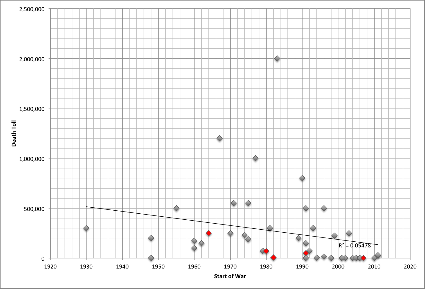
Below is a scatter plot of the death toll of each war vs. when it started. Ongoing (most at low-level) wars are in red in each scatter plot:


There’s no correlation between when a war began and its total death toll. This means that we haven’t been killing more people with new, advanced weaponry, but it also means the number of people dying in these wars is going down.

Additionally, one of the more disturbing trends we’ve seen recently regards the number of civilians killed in times of war. It’s very difficult to find statistics on this matter, especially since most civil wars take place in under-developed countries. However, in many civil wars, a vast majority of the people killed aren’t the soldiers and combatants on either side- they’re innocent civilians, killed by bombs or other atrocities. From the limited data I found on this, I’d estimate maybe 90% of people killed in the average civil war for the past thirty or so years were civilians.

The next chart is a plot of the percentage of the population killed vs. the starting year of the war:

 
Again, there’s no correlation between the two.

Finally, here’s a chart of the results of each civil war. Five are ongoing (four at a low-level), and two are listed as “N/A” because those wars were a result of a power struggle shortly after a revolution:


Most rebels are actually very successful in civil wars. About 1/3 of the civil wars I looked at ended with rebel victories. Another 13 ended in tentative peace agreements, which usually grants some demands of the rebels. Only seven of the 43 wars I analyzed ended with rebel defeats.

Why is this? Simple: The rebels are fighting for much more than the incumbent government. They want change, and will go to greater lengths to get that change. We can see a smaller version of this right here in America with- believe it or not- online and telephone surveys. The results of those polls are often skewed towards change because the people that want change are feel strongest about the issue are more likely to respond to the survey.

All things considered, the average death toll for the civil wars I examined was 266,940, and the average percentage of the population killed was 2.37%. 

In the Middle East alone, the percentage of population killed was very similar: 2.38%.  Taking into account African countries yields a higher percentage: 2.71%. For Syria, this percentage means 535,000-610,000 people would die in the fighting- twenty times the current amount. The 267,000 figure is much more plausible.

The length of the conflict is difficult to predict. The average length from the data was 9.79 years; not counting ongoing conflicts, it was 7.74 years. The figure for the Middle East alone was 7.87 years.  The first number actually makes sense; at the current rate, the death toll would reach 267,000 in a little under nine years.

Let’s compare this to the U.S. Civil and Revolutionary Wars. The Civil War lasted just over four years, yet took the lives of 625,000 people, the vast majority of them soldiers. The Revolutionary War, on the other hand, lasted over eight years- yet only 50,000 Americans were killed, with about 35,000 Europeans. Warfare has certainly changed over the years- and not necessarily for the better. The change from conventional battlegrounds has led to the deaths of many innocent people.

Now, to conclude. Based on the data, I expect the civil war in Syria will last about six or seven more years, and will cause the death of a little over 200,000 more people- most of them civilians. I sincerely hope that this prediction is wrong and the war ends quickly- but that’s not what the statistics suggest will happen. History does say, however, that the Syrian rebels stand a good chance of winning.

Friday, September 7, 2012

When Will The Next Big Hurricane Hit The U.S.?


I remember the coverage of Hurricane Katrina very clearly. I woke up and immediately went to watch the news, and Katrina was just coming in. We knew it would cause a lot of damage, but I don’t think anyone knew that it would cause quite as much as it did. In the weeks afterward, the costliest natural disaster in American history dominated the headlines.

I have a special reminder of Katrina every year: The hurricane made landfall in New Orleans on my birthday. This connection makes me think of the power of hurricanes annually- and they always fascinate me.

We like to think that we’re above the power of nature. We’ve climbed to the top of the world, and explored the depths of the sea. We’ve built buildings that are ridiculously high- it’s almost like we’re mocking nature, pretending to be invulnerable. And then, something like Katrina happens, be it a hurricane, earthquake, tsunami, anything; and it sends us crashing- sometimes literally- back to earth.

This year, I had another reason to think of hurricanes. On my birthday this year, another hurricane- Hurricane Isaac- made landfall in New Orleans. Thankfully, the damage caused by Isaac was nowhere close to the damage caused by Katrina; however, it was a reminder: at any time, there could be another hurricane just as strong as Katrina. So is there a way to predict when the next “big one” will hit?
____________________________________________________________________________________________________
The attribute that makes natural disasters so powerful is their unpredictability. Volcanoes may give a few weeks’ at max. Hurricanes form and make landfall within a couple of days. We’ve vastly improved our tornado warning system; now we have nearly fifteen minutes of notice! And earthquakes- well, good luck. The 2005 hurricane season was especially unpredictable- we’ll get to that in a little bit. But the variability of hurricanes is what makes predicting the next powerful one especially difficult.

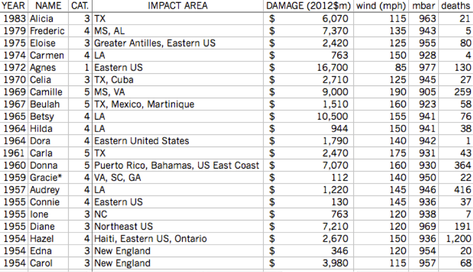
I could use all Atlantic hurricanes as my data set for this project, but I have neither the time nor the patience for that. Instead, I’m looking at only hurricanes who have been powerful enough to have their names retired:

There have been 77 retired names since 1954. One, Gracie (1959), is listed as retired by some sources but not others. Another, Allison (2001), was retired despite never actually becoming a hurricane.


There are a lot of extremely strong hurricanes in this set, but there’s still a very large number (there’s even a tropical storm!).  I’m going to narrow it down even further, to hurricanes that caused most of their damage to the United States. This eliminates hurricanes like Mitch in 1998, but I’m investigating when the next big hurricane will hit the U.S., not the rest of the Atlantic.


42 storms are represented above. I assigned a score to each hurricane based on each of the statistics on the right (scores not shown); Katrina (2005) was easily the most extreme hurricane ever to hit the United States.


Now we can begin looking for trends. Hurricanes overall appear to be getting stronger and it looks like there are more that have been retired in recent years, but…

R2 =0.07818


That’s not a very conclusive regression line, and logarithmic or exponential lines don’t really fit either. While the numbers from 2003-2005 are eye-catching (12 hurricane names retired in three years!), 2006 and 2009 did not have any hurricanes retired, and neither hurricane on that graph from 2010 made landfall in the U.S..

On the other hand, there has been a small increase in total named storms over the years:

http://upload.wikimedia.org/wikipedia/en/timeline/61b5be0856ccb449ab4978b2909ae8d7.png


There might be a bit of a cycle going on- in recent years, a two to four year cycle of powerful hurricane seasons appears. 2008 had several strong hurricanes three years after 2005, and 2009 had none after the weak 2006 season. But as we look back (and forward- just Irene in 2011), we can see that this theory doesn’t hold.

How about ENSO? We covered this phenomenon in depth a few months back, and it would make sense. El Nino supposedly represses hurricane growth, and our data supports that. Unusually strong El Nino effects match up with unusually weak hurricane season.  The reverse of El Nino, La Nina, would then spur hurricane growth, right? Not so fast- the data on hurricane seasons that correspond with La Nina doesn’t provide a strong correlation either way.

The key to this problem would appear to be the 2005 hurricane season. It was unusual in many ways. By all measures, it was the strongest hurricane season ever. Hurricane Emily was the earliest category 5 storm ever. Vince formed father northeast (into cooler waters) than any other storm on record. Wilma strengthened ridiculously fast after its formation. Hurricane Epsilon was the latest hurricanes ever, lasting deep into December. Tropical Storm Zeta went all the way into January. And yes; those are Greek letters, meaning that the 21 letters from the English alphabet were exhausted- the only time this has ever happened. In all, the 2005 season produced 31 tropical depressions, 27 named storms, and 15 hurricanes (7 of category 3 or above). It accounted for 3,913 deaths and over $150 billion of damage.

I can find just two unusual aspects concerning the climate in 2005. The first is that El Nino was expected to develop, but didn’t. The second is that the years leading up to it- 2002-2005- were four of the five warmest years on record (at the time). Fourteen hurricane names were retired for these four years, and the one other year in the top five was 1998, which saw the wraths of Hurricanes Mitch and Georges. Did the heat finally reach a climax in 2005, causing the extreme hurricane season? Maybe, but more likely not. In the Pacific, 2005 was an average or below average year. (It should be noted that 2006 was the most active Pacific season since 2000, however.) Additionally, many of the years since 2005 have been warmer, and yet none of them had hurricane seasons quite as strong.

Overall, I just can’t find a trend for powerful storm season. Hurricanes are simply so unpredictable that a storm season predicted to be “slightly above-average” can produce 28 named storms; the opposite can be true as well. We don’t know when, specifically, in a season the next big hurricane will hit, or even what year it will be.* We can make guesses, but nature will laugh at us and prove us wrong anyway. The best we can do is prepare for the worst and try to minimize the damage and loss of life.

*In 2011, Colorado State University, one of the leading hurricane prediction centers, announced that it would no longer be releasing quantitative forecasts six months prior to each season, as  "...forecasts of the last 20 years have not shown real-time forecast skill." Hurricanes are unpredictable even for the professionals from a long distance away.